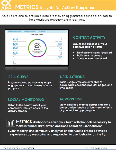
Dashboard data illustrates what types of content, communications, collateral and promotions have the best success rate or highest form of engagement to help you better understand what works and what doesn’t when it comes to enhancing the user experience and overall customer journey.
What: Metrics aggregate data based on app engagement. KPI’s are mapped to specific touchpoints that provide insights into user behavior.
Why: Customer data gives you insight into everything you need to know to make data-driven decisions. These quantifiable insights help you craft more holistic experiences that account for customer or attendee behavior.
Real-time metrics deliver results at your fingertips so you can run an agile customer experience program and measure ROI for optimized results.
In an on-demand society, we know customers want more personalized experiences, so knowing what your customer is most interested in based on their consumption behaviors will provide you the tools to map out enhanced customer touchpoints that make the time they spend with you on-site and virtually, more meaningful.
By 2020, personalization engines used to assess and account for customer intent can increase digital business profits up to 15%.
Use Case
Mary Plansit, Briefing Program Manager at Silcom Tech, is planning for the upcoming TechEd Day where local business can come on-site to the Silcom Tech EBC and participate in sessions highlighting best practices, how-to tips, and advice about digital transformation.
In preparation for the event, Mary sent out a pre-event poll to all attendees to gauge which sessions had the highest interest rate:
- 1:1 Problem solving w/ solution engineers (48%)
- Roadmap and future product releases (13%)
- Factoring IoT into the business equation (22%)
- Platform as a Service (17%)
Mary saw the overwhelming interest in the 1:1 sessions, so she adjusted the room configurations to accommodate a larger crowd.
Leading up to the event, Mary sent out 3 notifications (1 per day), so that she could build excitement as well as share information with the expected crowd. Also, Mary encouraged her team as well as some of the presenters to begin posting their thoughts in the activity stream to also generate excitement and stimulate conversations from within the app, giving organizers and attendees the opportunity to create a sense of community and engagement.
During the sessions, Mary checked in with the metrics dashboard to see who the top or users were. This was a way Mary could be sure to highlight these people to a few sales reps to engage with before the day was over. She was able to share with her team what content they were accessing and which sessions they were attending so that they were equipped with a good customer insight to help them make a better connection.
After the event, Mary also used the metrics dashboard to complete an assessment of the event overall. She was able to see the # of posts to the activity feed, posts by user, the # of notifications that were sent by here team as well as the open rate for these notification. She also found some interesting data around app sessions, page views, and poll/survey response within the mobile app that she was going to review with the briefing team so that hey could adjust and pivot their agenda for the TechEd day next quarter. Being flexible, being insightful, and being smart is a part Silcom Tech's objectives.